

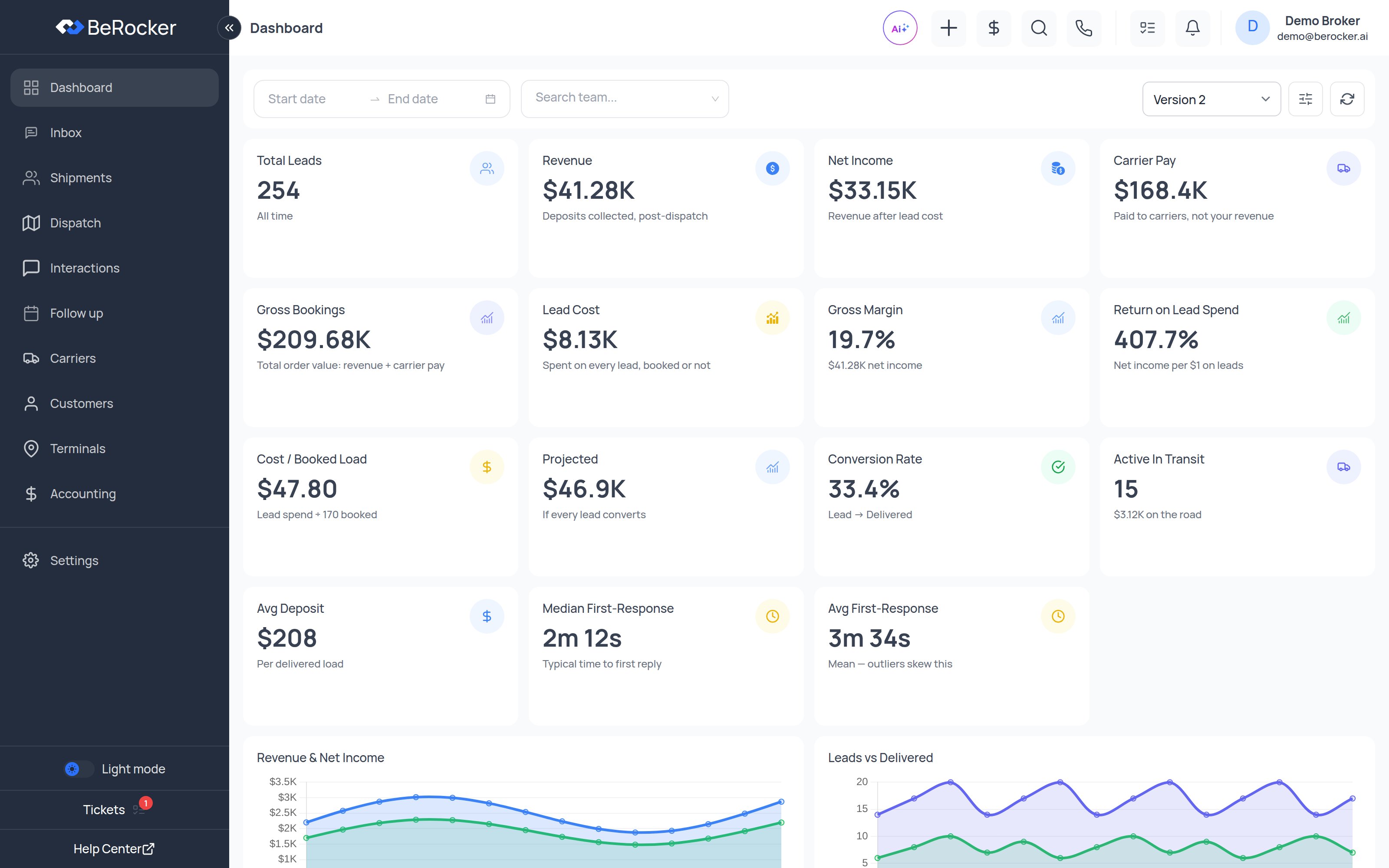
Filters
Across the top: a date range, a team / agent picker, and a refresh button. Leave the date range empty for all-time.Period-over-period comparison arrows only appear when you filter to a date range. An unfiltered
dashboard is all-time and has nothing to compare against.
The tiles
The charts
- Revenue & Net Income over time.
- Leads vs Delivered over time — volume in against loads out.
- Margin trend — your gross margin percentage day by day.
- Pipeline funnel — how many leads reached New, Order, Signed, Paid, Posted, Dispatched and Delivered. Where the funnel narrows is where your process leaks.
- Top agents — deposit total on booked loads and delivered count per agent.
- Top lanes — ranked by gross bookings, with revenue and lead count.
- Lead sources — per source: leads, booked, revenue, lead cost, net income, cost per booked load, and booking rate.
The lead-sources table is the one to check before renewing a provider contract. A source with lots
of leads and a poor booking rate can cost more than it brings in.
Dashboard versions
The version picker in the top right switches between dashboard layouts (Version 1, 2, 3). They show the same underlying data in different arrangements — pick whichever your team reads fastest.Related
Reports
Leads status, user charges and lead sources, exportable.
Accounting
The transactions behind the revenue number.
Dispatch
The loads behind “Active In Transit”.
Lead sources
Where the lead cost figures come from.